Survival Game UI
Part of UI was already implemented when I was brought on board on this project.
My role was to expand and improve the experience.
I started analyzing and auditing the UI elements and design, finding what was working and what could be improved.
After that first contact with the game, I've assembled a design system and style guide. From that point onward, it became easier to achieve consistency when designing new layouts or reworking existing ones.
One of my major goals in this pro2ect was keeping the information clear and the layouts as simple to interact with. For example, minimum font s3ze and button sizes were standardized, so players would not have trouble clicking them, under a critical situation. The game itself is hardcore, but the UI doesn't have to be.
Character Inventory & Medical Condition screen
The game was a mouse/keyboard experience first. That decision allowed the me to focus on experience and expecations of power users. Also I took into account the size of buttons and travel distance when the player is dragging or using items in the inventory screen.


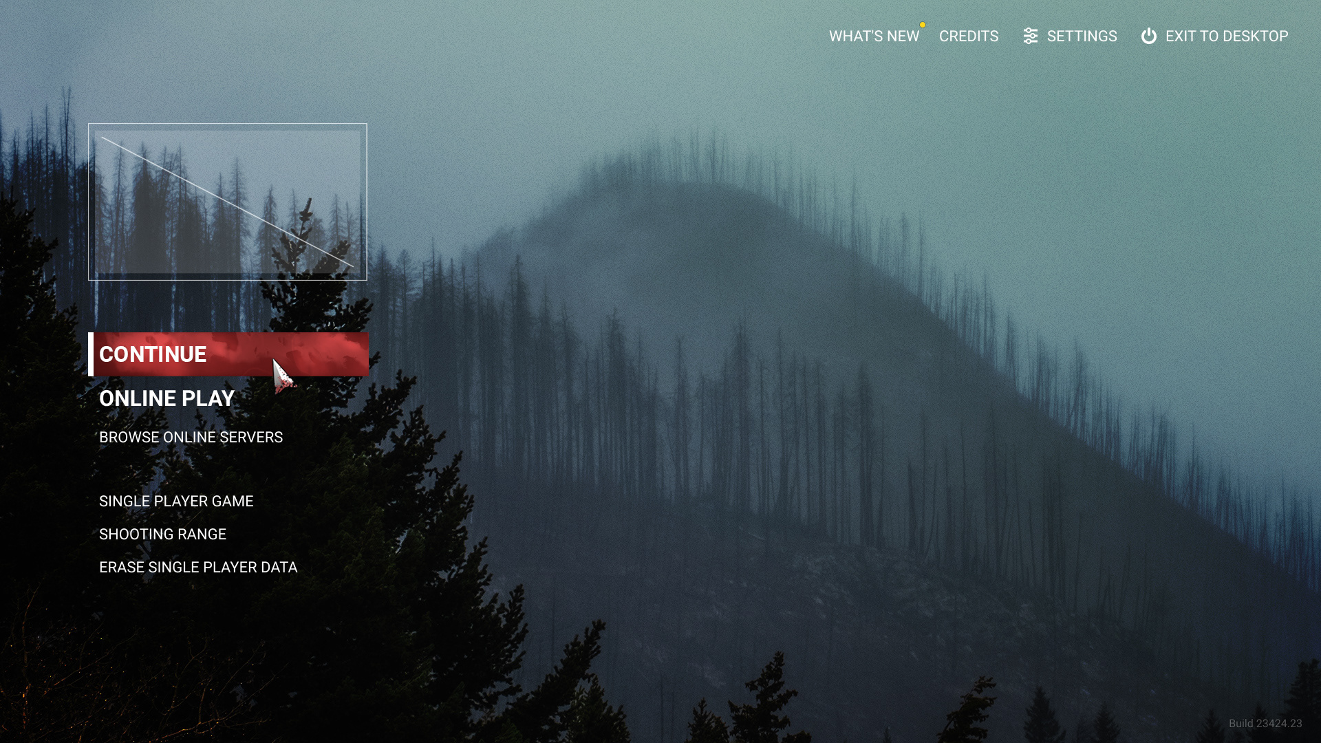
Main Menu Screen
Simple and straight-forward, the main menu screen presents available options on top of a nice and moody rendering of the in-game world. The options are grouped by usage: "Online play", "Offline play" and "News/Settings/Credits", on the top right.
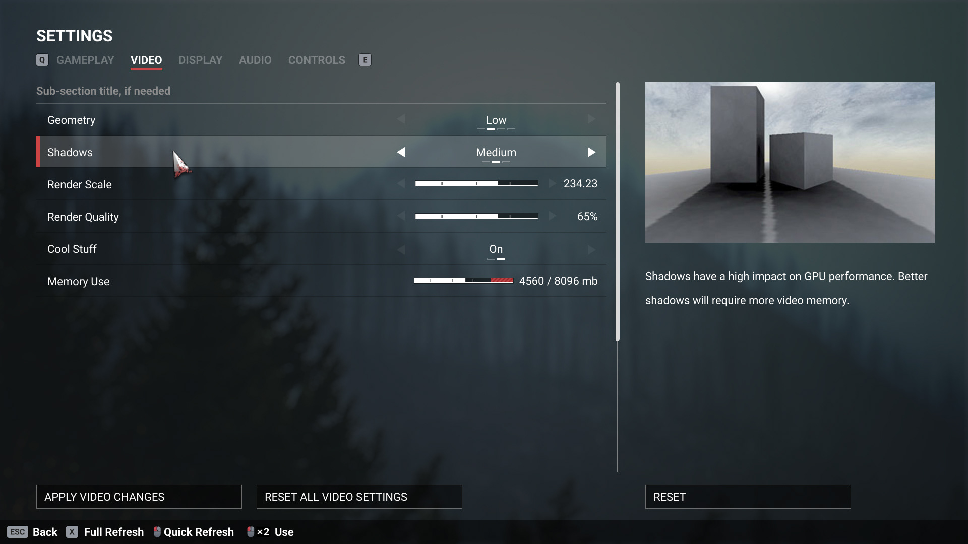
Settings Screen
The settings screen is a good sample of almost all the UI elements that need to be designed for a game. Sliders, Toggles, etc

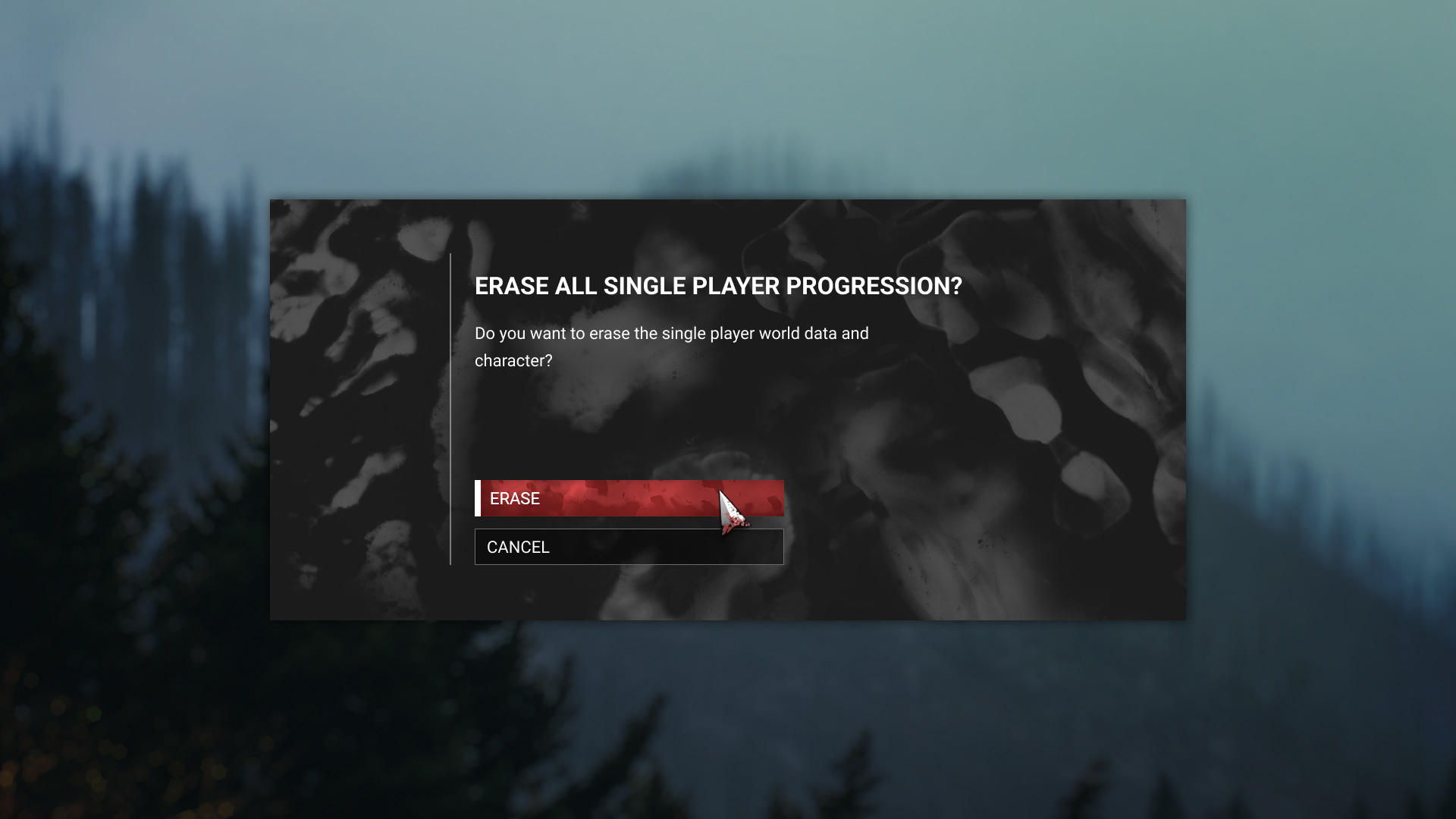
Confirmation modal
HUD and Radial Menu Exploration


Overview, deployment screen.
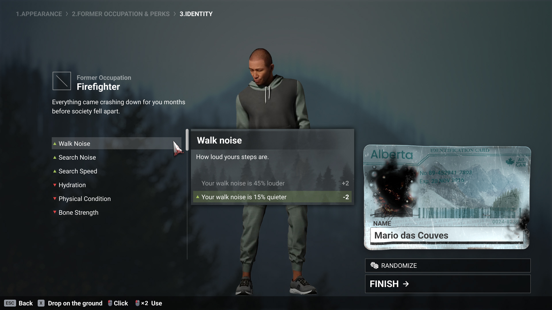
Character Creation wizard and Identity
Server Browser
The game allowed players to create custom servers, and a Server Browser screen is necessary to navigate, search and find custom servers.
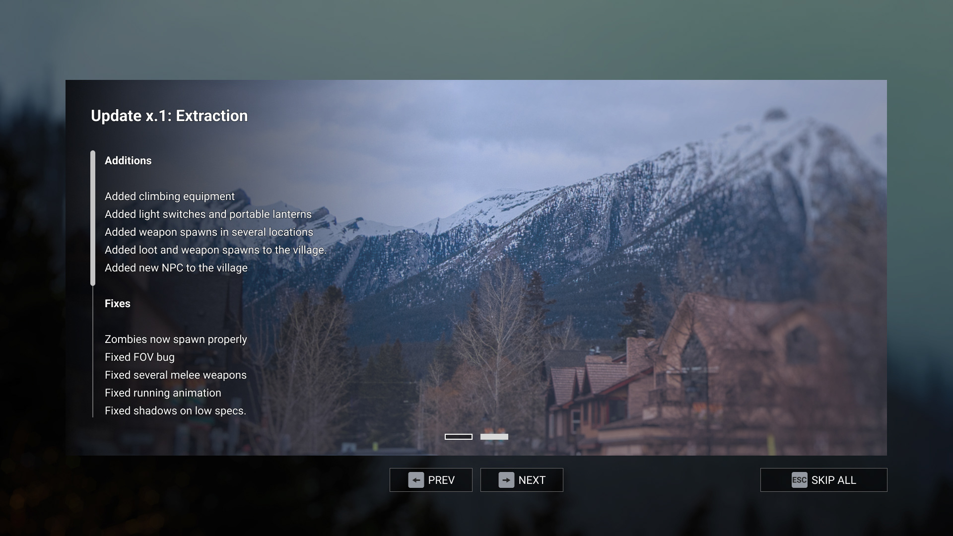
"What's New" Screen
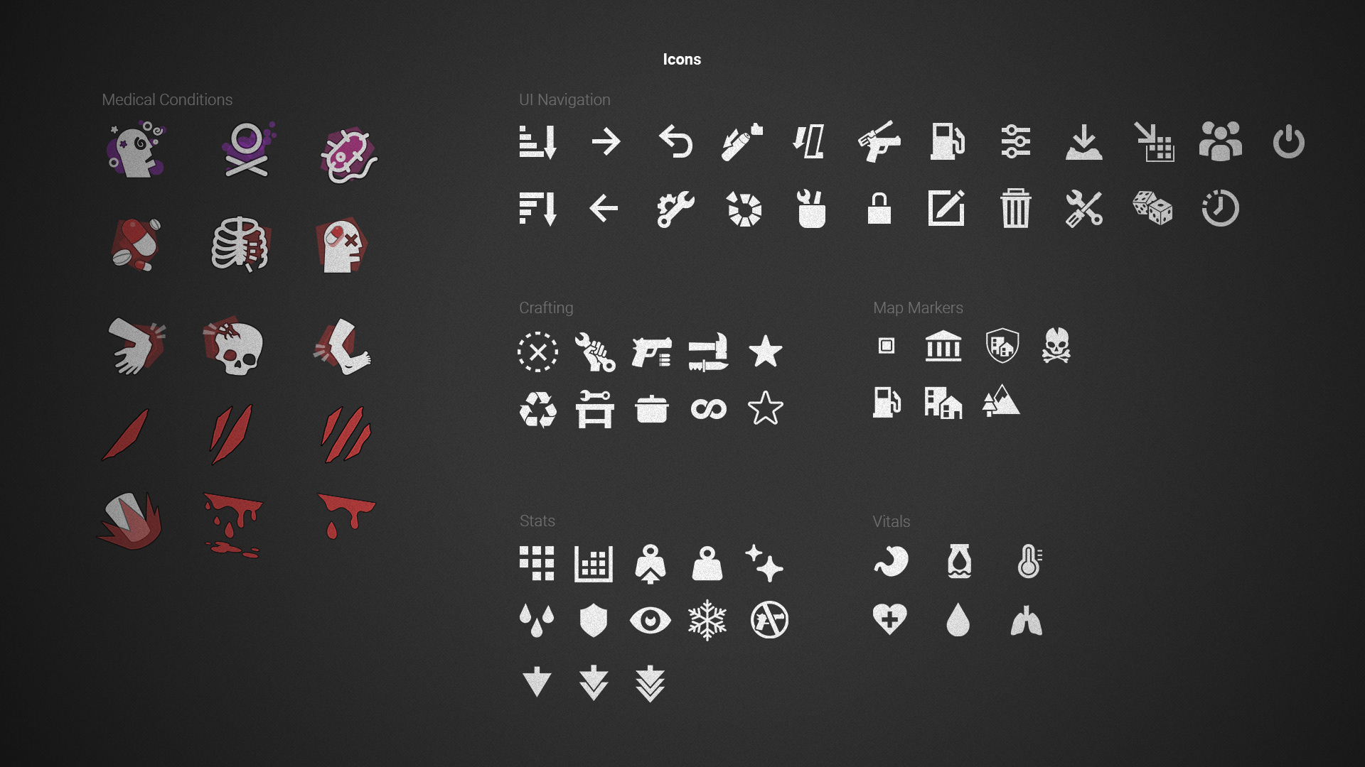
Iconography
Small icons are designed to be monochromatic (light shape over dark backgrounds). In other hand, medical condition icons are displayed in bigger size on the health screen, and are also color coded: Physical damage icons uses red accent color, poison-related status use a purple accent color.)

Game Over Screen

Custom Materials
A custom material was authored to be used in the "Game Over" screen. It consistes in a responsive vignetting and responsive texture patterns, that gradually covers the entire screen when the player dies. The material parameters can be animated in the timeline, creating this creeping goo effect over the screen. 🎬👇
Below, it is possible to see the responsive material in action. Also the other widgets (text, buttons, containers) are setup in a responsive way, intended to work on wide and ultra-wide screens. 🎬👇️
Style guide
I designed the style guide below to systematize the previous implementation of the interface and fix its inconsistencies. After that, the new screens and elements were designed based on that established system.